Exporting the Result of your Analysis
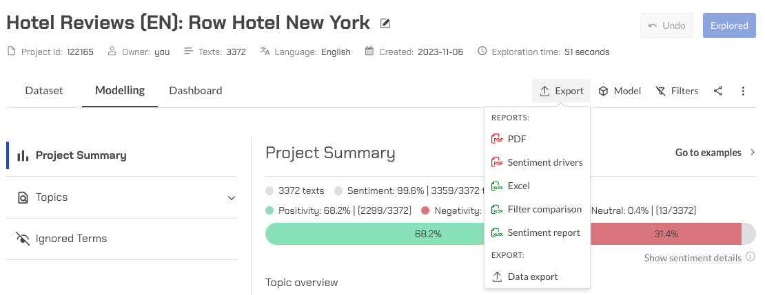
After each iteration and before you make any changes to your project, Explorer gives you the option to export your analysis in different formats.

If you want to have a brief report of your analysis similar to what you see in Explorer GUI, you can save your project as either PDF or Excel. In case you want to have a detailed result of your analysis with respect to individual texts, you can choose Excel or CSV.

Analysis exported will be available for download in the reports tab as described in the project reports page.
Save as Excel and Full CSV
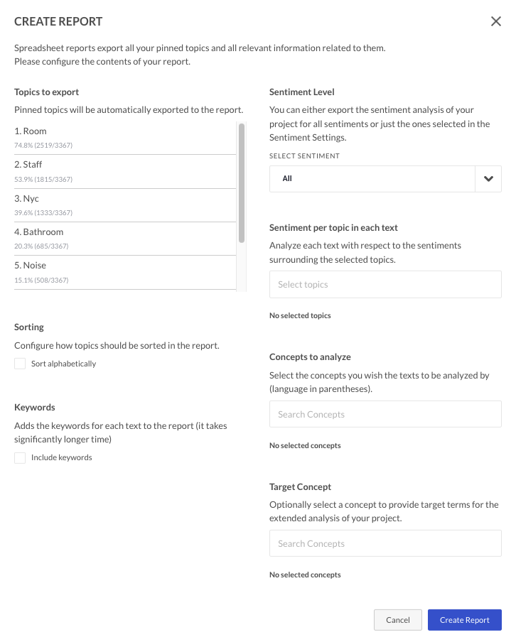
If you select Excel or CSV format, you then have the option to configure a number of extra parameters in your report.

Topics can be sorted alphabetically or by frequency (default option). Keywords can be included or not. You can choose which concepts to analyze and which topics to count sentiment for. A target concept for the whole report can also be set.
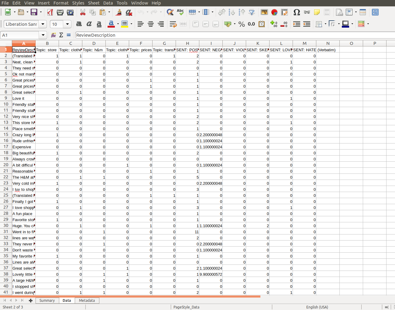
When you download the result of your analysis, aside from the summary tab, you you also will have a data tab containing your original data appended by the analysis result from Explorer. Since all cells are handled as text, eventual metadata specifying the cell type is lost as well as any eventual formulas existing in the original excel file. If the meta-type of a number column is important for you then just export the report in a CSV format and use the import function in excel to create an excel version of the report. Excel normally interprets the text containing a number as a number type, given it is according to the format of the excel application importing the CSV file. Explorer performs a row based analysis of your data in respect to your pinned topics, target concepts and sentiments, and for each text it adds the result of the analysis to the corresponding row. In the following we explain the appended columns.
Pinned Topics
The first added columns are the columns regarding to your pinned topics. You can see the name of each pinned topic in a header of a column. A cell in a topic column contains 1 if the corresponding text includes that topic, and 0 otherwise.
Sentiment
The next added columns are the ones containing sentiment scores. Explorer measures 8 standard sentiments for each text; they are: SENT: DESIRE, SENT: FEAR, SENT: LOVE, SENT: POSITIVITY, SENT: SKEPTICISM, SENT: NEGATIVITY, SENT: HATE, SENT: VIOLENCE. If you have Neutral sentiment feature on (see Project Settings - Sentiments), then there will be a column for NEUTRAL as well. You can see their names on the header of the columns. Each cell in a sentiment column contains the score of that sentiment for the entire corresponding text. In case you have selected a Target Concept for the analysis of your project, the sentiment scores will be restricted to the sentences that contain at least one of the terms in any of those concepts.
Sentiments Per Topic
For a selected topic, you can gauge the sentiment in each individual text and add a column for each sentiment to the report. For instance, if you select a topic after clicking the Export as Excel or CSV dialogue box to bring up the Configure Report Box, each text in your project will be analyzed with respect to the Positive, Negative, and Skepticism sentiment around the topic, and the columns for the sentiment scores of the specific topic(s) chosen will be added to the resulting Excel file under the name Sent: Positivity(topic name).
This is useful when you want to compare the positive sentiment score of the verbatim – located in the usual column called SENT: POSITIVITY. With the topic's positive sentiment score – located in the new appended column called SENT: POSITIVITY (what ever topic you chose). For example, if your topic's positive sentiment score is very large and almost as large as your verbatim sentiment score. Then there is a strong indication that the topic is driving the positivity of the verbatim.
*note adding a lot of topics to analyze will add thee columns per topic. Thus, the report generation time will be affected, the more topics are selected.
The Sentiments per topic and per verbatim are used in the Driver PDF report.
Concepts
You can select your sentiment-based concepts under "Concepts". In this case, Explorer computes the strength of each concept for each text and shows them to you in new columns, one for each concept. Here the computation is performed in the same way as for Explorer built-in sentiments.
Target Concept
The next columns is the target concept that you have chosen to include in the report. The Explorer will append two new columns for your chosen target concept. First, a column in the Excel file having the concept name in its header. Each entry in a concept column is the number of distinctive terms in that concept that are included in the corresponding text. The other column includes the sentences that appeared in the corresponding text.
Keywords
The next columns in the report are the keywords columns. Keywords are those terms that best describe the subject of the texts. There are 4 different keywords columns in the Excel report:
-
The first column is "Keywords”. Explorer identifies the most significant keywords in each text and inserts them in the corresponding entry of this column in form of [keyword 1, keyword 2,…,keyword n] where the value of n can be different for different texts.
-
The second column is "Qualified Keywords”. Each entry in this column is a list containing those keywords from the previous column (means the "Keywords” column) that a Wikipedia page exists for them. Explorer considers these keywords as qualified keywords.
-
The third column is "Expanded Keywords”. Each entry in this column is a list containing the semantically similar words to the keywords of the corresponding text.
-
The fourth column is "Qualified Expanded Keywords”. This column contains those terms from previous column that have been qualified by Wikipedia as before.
-
The last column is "Summary”. This column contains the most significant sentences in the texts.
Weight column
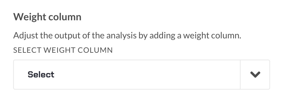
To use this feature, your dataset must have a column containing exclusively numerical values. With the weighted column selector, you can perform calculations based on values from a designated column, applying weights to each value to determine their relative significance. E.g., if the user knows they should treat female respondents as being more important in a survey, they will assign them a higher weight (relative to the male respondents) and use that weight to adjust the metric of importance in the final output.
Upon selecting the weighted column option, our system automatically generates a dedicated tab labeled “Weighted Summary” within the Excel report. This tab serves as the repository for the computation of weighted sums. Each value in the weight column is multiplied by the corresponding row value, i.e. positive, negative and occurrence count, prior to being aggregated.

Drivers report PDF
Satisfaction Drivers is a new form of report on the base of Explorer's best features that provides an effortless and efficient "one click" analysis highlighting satisfaction drivers in survey responses, reviews, etc. It’s quick, easy, and doesn't require any additional user input.
In the other words, it gives a direct answer to the question "What drives respondent satisfaction?".
The "one click" functionality is accessed directly from the Explorer start page. After an Excel file with at least one text column is uploaded, the project is created and explored. It is also possible to generate a Satisfaction Drivers report by choosing "Driver (PDF)" in the "Save as" drop down menu in your existing projects.
The report will show a simple and neat visualisation of a handful selected drivers from the given datafile - both positive and negative (if applicable).
The axes of the diagram are: Y axis - correlation to overall satisfaction, X axis - driver satisfaction ratio (in %). Each bubble represents one driver, based on the analysis of topics and their related topics. The drivers’ position on the diagram represent their importance and meaning for the customer satisfaction.
Top drivers: The average net satisfaction rate for a driver. Both positive and negative sentiments are used to judge the satisfaction of a driver. Ratio: The ratio of texts that contain a driver where the average net satisfaction rate is positive/negative. Correlation: The correlation between driver sentiment and overall sentiment. Occurrence: The amount of texts in that the satisfaction driver occurs.
This is a PDF report that mirrors the web application. It will show the Groups, Topics, Terms that build up a Topic, and the Related topics for each Topic. This is useful way to share the report.
Filter comparison
An Excel report that compares different filtering conditions (or configurations) applied to a dataset in order to provide insights on the topic being analyzed, and shows the results of each condition in terms of net sentiment, positivity, negativity, and relative occurrence, as well as how each condition compares to the others.
The report has different sheets: the first sheet is called "net sentiment" and shows the overall sentiment of the reviews after applying the different filters. The second sheet is called "negativity" and shows the proportion of negative reviews after applying the different filters. The third sheet is called "positivity" and shows the proportion of positive reviews after applying the different filters. Finally, the fourth sheet is called "relative occurrence" and shows how often a particular filtering condition appears in the data compared to the other conditions.
Each sheet in the report has columns with the following information:
-
Topic: topic or theme that is being analyzed.
-
Partition: name of the filter that is being applied.
-
Partition score: the result of applying the filter to the data, such as the proportion of positive reviews after filtering by department
-
Average (other partitions): percentage that represents the average of the scores for all the other filtering conditions, which can help you understand how the current condition compares to the others.
-
Partition score difference: this is the difference between the current score and the average score of the other conditions, which can help you see if the current condition is particularly strong or weak compared to the others.
In addition to the sheets already mentioned, there is also a separate sheet for each filter configuration that includes metadata information. This metadata information provides details on the specific filtering condition applied to the data, such as the values or ranges selected for the filter, and any additional project information. This metadata can be useful for documenting and replicating the analysis, as well as for communicating the analysis process to others.
Data export
You can export the data so it can be used with Looker Studio or PowerBI integrations.