Legacy dashboard (deprecated)
Warning
Note that the current dashboard will be soon deprecated and replaced by the new Explorer Dashboard, powered by Apache Superset. On new projects, the user will see the new dashboard although the can switch back to the current solution for a limited period of time.
You can click the "Dashboard" button in the Secondary Menu to navigate to the Dashboard view of your project. Note if you want a walkthrough example of the calculations involved you can visit the support page or click here.
When you created your project with a column of text to analyse with The Gavagai Explorer, we try to identify other columns which could be grades or ratings in your dataset. If we do find any such columns, we generate the dashboard graphs using one of these columns as the metric. For example, if two topics are being compared in the dashboard, the score for each topic will be the average grade for the documents matching the topic. If we are unable to find any such column in your dataset, the dashboard graphs will be generated using sentiment as the metric.
If you would like to change the metric used in the dashboard to another grade column in your dataset or to sentiments, you can do that in the Project Dashboard Settings section. Additionally, the dashboard will, by default, contain graphs for all the topics in your analysis. If you would like to change this behaviour to only include pinned topics in your dashboard, you can do so in the Project Dashboard Settings section as well.
Throughout the explanation of the dashboard and its graphs, Sentiment, Grade, NPS, or rating could be used interchangeably.

Main Dashboard View
After entering the Dashboard view you will see different graphs that represent the results of your project.
In the top right you can share your dashboard as a website. By pressing the button you will generate a new website and you will receive a link to be able to share with anyone. Note by visiting the link, it will not allow you to edit any of the graphs, only see the graphs.
Occurrence Grade Matrix or Occurrence Sentiment Matrix or X-Y Scatter Plot of Topics
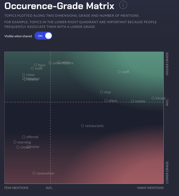
In this graph the different topics found from The Gavagai Explorer are plotted along two dimensions, the x-axis (left to right) is how often the topic is mentioned and the y-axis (up to down) is that specific topic's sentimental score or average topic's grade score. In other words Topics in the top right quadrant are topics that are both spoken about a lot and have a high sentiment or average grade. Note that in this graph the header says Occurence-Grade Matrix because there was a numerical score column called Grade in the dataset that was uploaded. If there was no such score, then it would have defaulted to Occurrence-Sentiment Matrix. You can click any of the topics to go to the Topic View. Read more about the Topic View in Topic Dashboard View
Not all topics are included in the matrix - the topics that the system detects as "most important" are included by default. All topics that are pinned (or belong to groups that are pinned) are always included in the matrix. As mentioned earlier, if you want to include only the pinned topics in the matrix graph, you can do so by enabling the relevant settings in the Project Dashboard Settings.
Important Topics
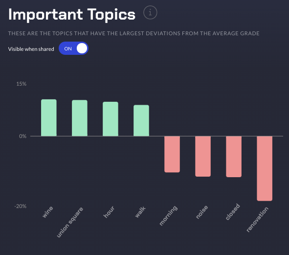
In this graph the different topics found in the Occurrence Grade Matrix that had the highest or lowest Sentiment or Grade from the average are plotted here. The height of the bar is the difference from the average in percentage. This graph is helpful because you can see what topics are pushing the average Sentiment or Grade higher or lower than average. You can click any of the topics to scroll down to the Related Topics graph. In this case, the documents that match the topic "wine" have 10% higher average grade than the average grade of the documents matching all other topics in your dataset.
Related Topics
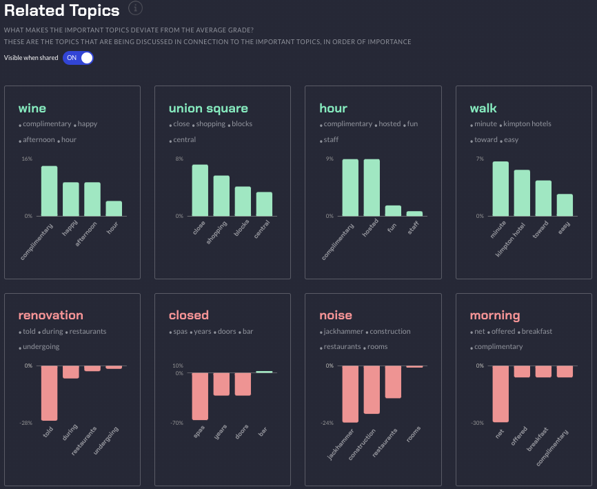
Related topics are topics that are frequently mentioned along with the respective important topic (see here for more information). In this graph, for each of the important topics, we show you what the system identifies as the most important related topics - These are the related topics, which when they occur in a document along with the important topic, have a higher or lower average grade than that of all the documents matching the important topics; Looking at an important Topic we can see important related topics that help drive that important Topic's average Sentiment/Grade up or down. For important topics with an average grade or sentiment below the average grade or sentiment for the entire dataset, we show the negatively driving related topics, and for the important topics with a higher average grade, we show the positively driving related topics. The height of the bar is an indication of how much the related topic causes the grade or sentiment score to vary from the average grade or sentiment score of the topic.
For example, in this case, documents matching the topic "wine" and also match the topic "complimentary" have an average grade which is ~15% higher than that of the documents matching the topic "wine". Conversely, documents matching the topic "morning" and related topic "net" have an average grade which is 30% lower than the average grade of the documents matching the topics "morning".
All Topics Bar Chart
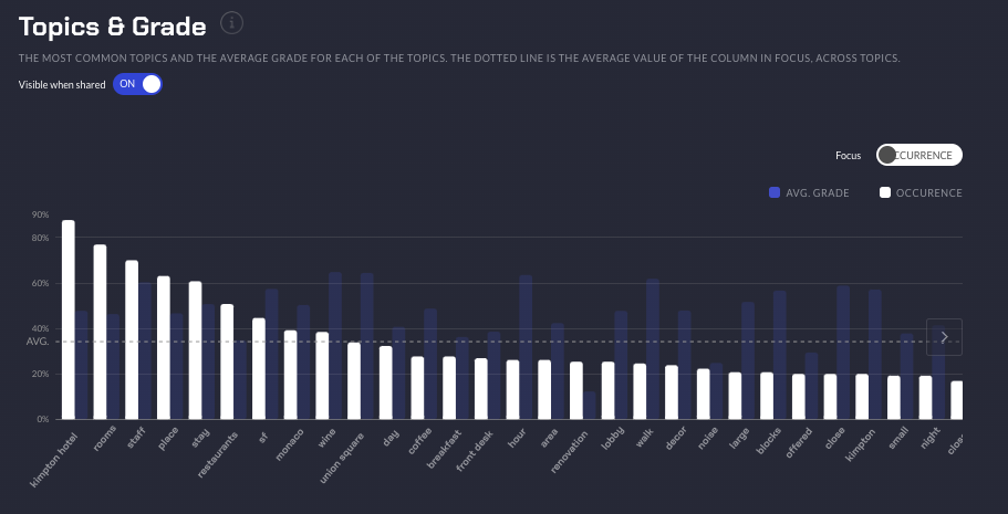
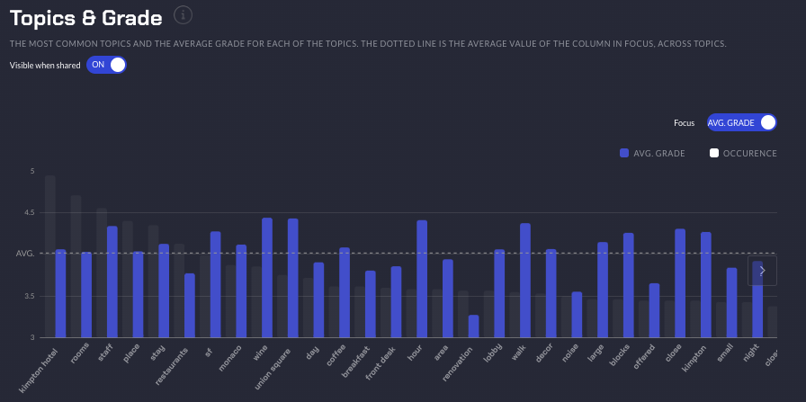
In this bar chart, each bar represents a topic and the height of the bar represents a value depending on the toggle activated. In the first graph, the white bars represent the topic's occurrence and in the second graph, the blue bars represent the topic's average sentiment or grade.
Comparison Graph
If you click Add New Graph, there should be a menu that appears to choose between two graphs. The two graphs allow you to create analysis into your data using your other metadata columns (the column that is not the text review column that was chosen to be analysed) such as the Grade, or a demographics column such as city or age.
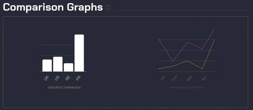
Let us begin with speaking about Grouped Comparison graphs.
Grouped Comparison Graphs
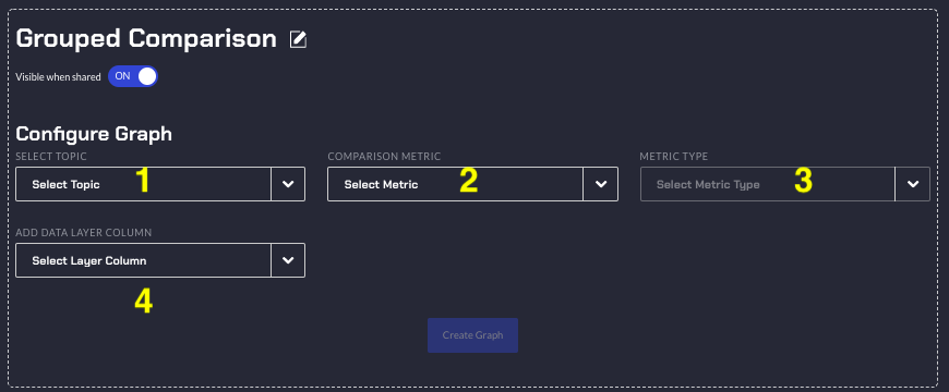
There are four fields that need to be configured. At the top you can click the little edit button to edit the name of your graph.
- Choosing a Topic, this is which Topic that will be analysed
- Choosing a Metric, there are several options, the Topic's Sentiment, Occurrence, or NPS/Grade. This will be the Y axis values in your grouped comparison graph.
- Depending on which Metric is chosen:
- Sentiment: You can choose Positivity, which is the Topic's Positivity score, Negativity, which is the Topic's Negativity score, or Net Sentiment which is the average Positivity Score minus the Negativity Score for all documents matching the topic.
- Occurrence: You can choose Absolute, which is the absolute number of mentions speaking about that topic. Absolute Percentage is the percentage of mentions for that specific topic across the metadata columns (number of times a specific topic is mentioned / total mentions for that topic). Relative Percentage is the percentage of mentions for that specific topic for that specific metadata value (number of times a specific topic is mentioned / total number of reviews that match that metadata value)
- NPS / Grade: This is the Topic's average nps, grade, or numerical score's average that the reviews that spoke about the topic had.
- Data Layer Column: This is the column that values will be chosen from that your Topic will be split by. Note you can filter out values from the chosen data layer column. You can have up to two data layer columns.
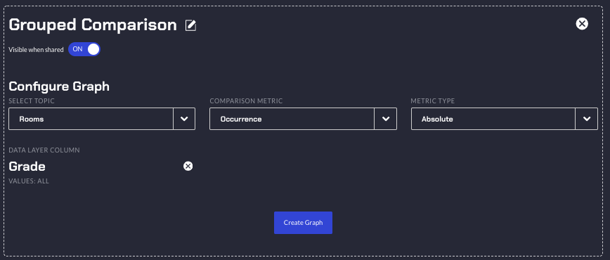
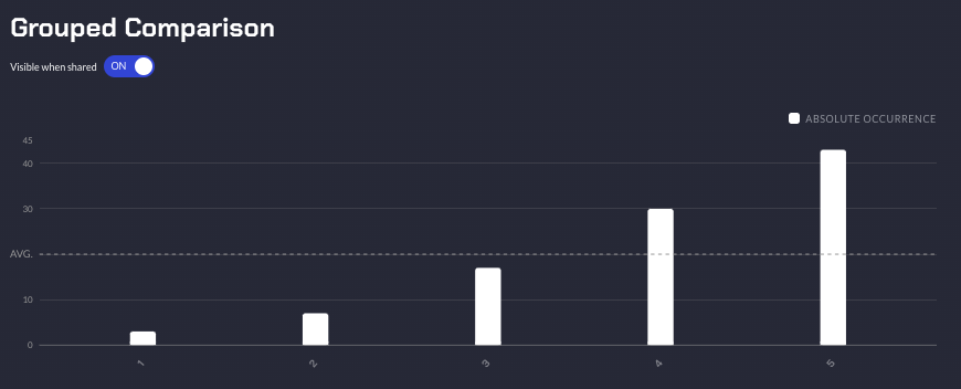
After configuration of the Grouped Comparison Graph and clicking Create Graph this is what it should look like. Where the Topic Room's absolute occurrence across the different Grade score values, 1, 2, 3, 4, and 5.
Below are examples for the same Topic but with the three different Occurrence options.
Absolute:

Relative Percentage:

Absolute Percentage:

Time Series Comparison Graphs
If you have a time series column in the data you uploaded then you can also compare Topics over time.
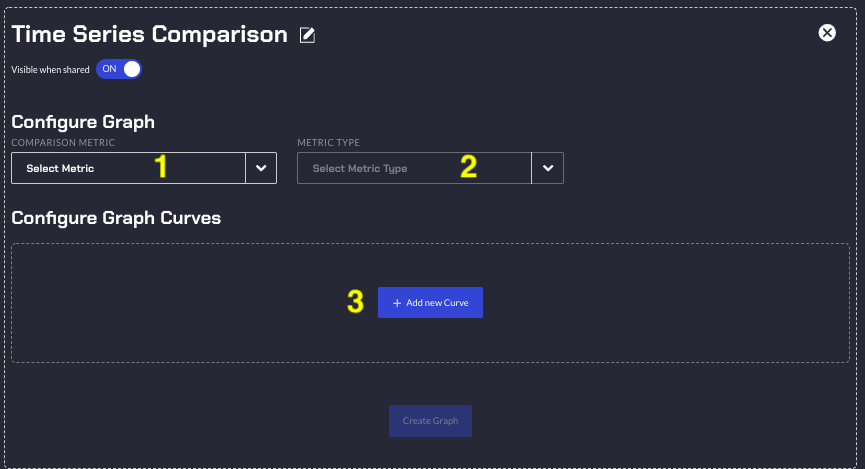
There are three fields that need to be configured. At the top you can click the little edit button to edit the name of your graph.
- Metric that will be compared.
- Sentiment
- Occurrence
- NPS / Grade
- Depending on which Metric is chosen:
- Sentiment: You can choose Positivity, which is the Topic's Positivity score, Negativity, which is the Topic's Negativity score, or Net Sentiment which is the average Positivity Score minus the Negativity Score for all documents matching the topic.
- Occurrence: You can choose Absolute, which is the absolute number of mentions speaking about that topic. Absolute Percentage is the percentage of mentions for that specific topic across the metadata columns (number of times a specific topic is mentioned / total mentions for that topic). Relative Percentage is the percentage of mentions for that specific topic for that specific metadata value (number of times a specific topic is mentioned / total number of reviews that match that metadata value)
- NPS / Grade: This is the Topic's average nps, grade, or numerical score's average that the reviews that spoke about the topic had
- Add a New Curve. You can click the edit button to change the name of this curve. This will allow you to select a Topic which will be rendered across your time series from your column with the time data.
- You can choose a filter from your other metadata columns such as Grade to only see the Topic over time but will be filtered using the other metadata columns. And from that filter, you can choose different values to be used as a filter.
- You can add up to five curves per each time series graph.
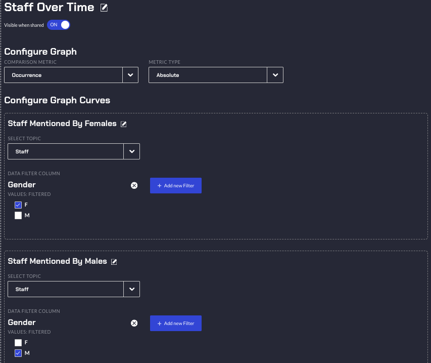
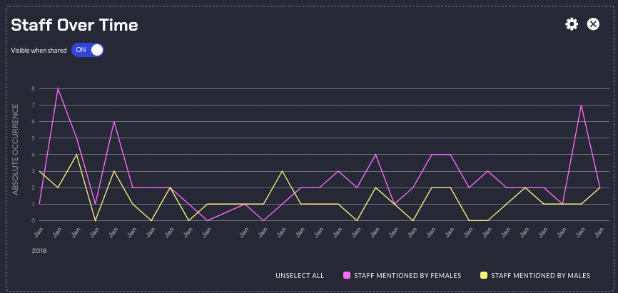
After configuration of the Time Series Comparison Graph and clicking Create graph this is what it should look like. Where the Topic Staff's absolute occurrence across time is plotted. Note there are two curves which represent the Males and Females speaking about the staff. Male or Female were from the gender column from the data set, depending on your own data set you might have other demographics data that you can use.

Once the time series graph has been created, you can apply the date range and the granularity filters to view the graph result for specific date range with the suitable granularity as per your requirement. The date range and granularity filters are available for the Related Topics Over Time and the Topics & Sentiments Over Time graphs in the Topic Dashboard View.
Topic Dashboard View
After clicking a topic on the Occurrence Sentiment/Grade Matrix or Related Topic or the Topic and Sentiment/Grade graphs you will be taken to the topic view of the Dashboard.
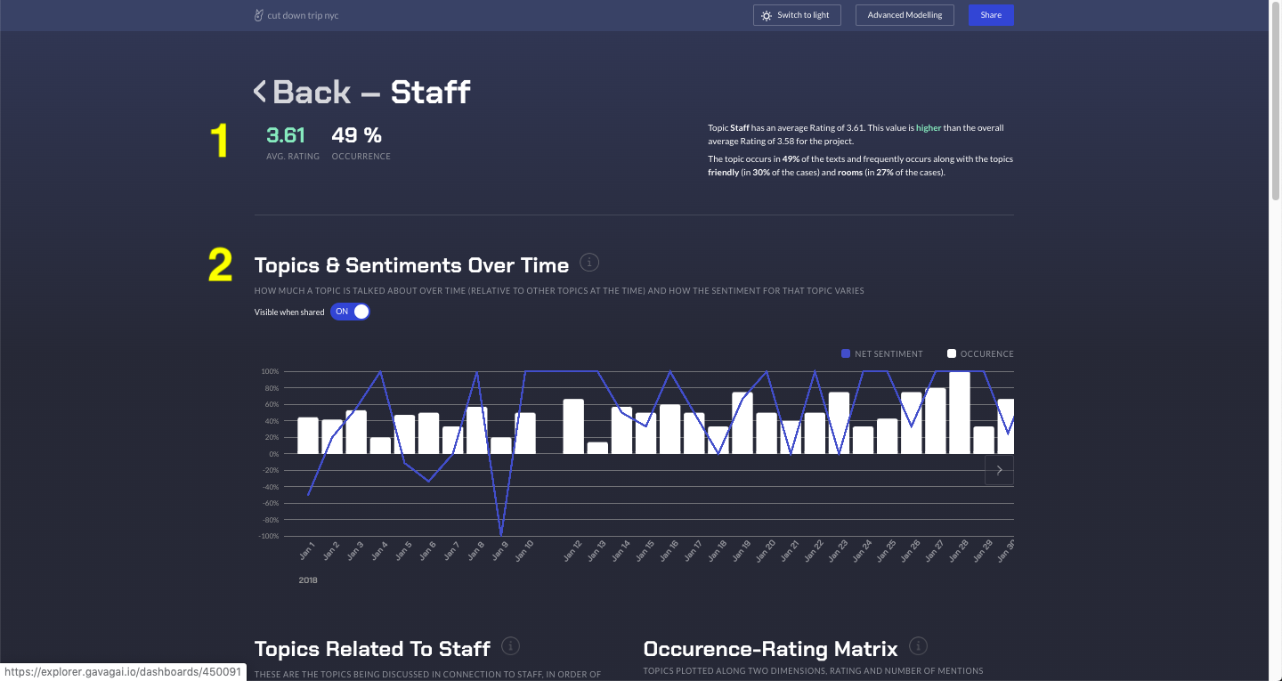
- This is a quick summary of the Topic. Here if you have a Grade or Numerical score column, it will show the average score for all the reviews mentioning this topic otherwise if there is no score column it will show the Positive/Negative/Neutral sentiment breakdown for this topic. Note the Grade score's coloured green because the topic's average grade is higher than the total project's average grade. This is indicating the topic is correlated with a higher review score. It also shows the topic's occurrence in percentage of the entire project.
- If there was a time series column then there will be a combo bar and line chart. The bars represent the topic over time and the height is the topic's occurrence in percentage on that time series point in time. The line represents the topic's net sentiment in percentage on that time series point in time.
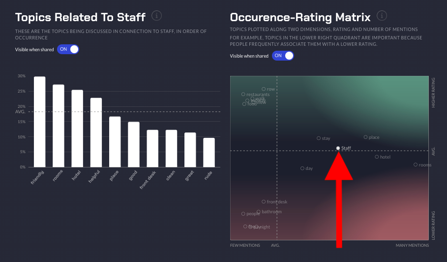
The graph titled Topics Related to Staff is a barchart that represents other topics mentioned and their occurence when the specific topic is mentioned, in this case Topic: Staff. The height of the bar chart represents the percentage occurrence of a Related Topic when, in this case Staff was mentioned.
The respective topic is also highlighted on the Occurrence Matrix graph which was explained above.
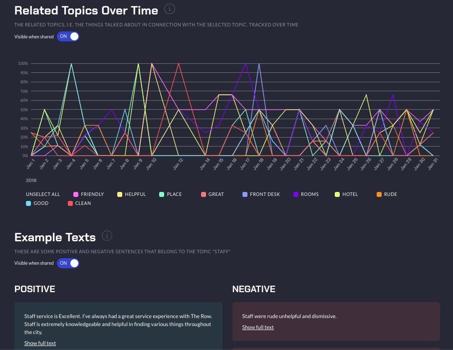
The graph titled Related Topics Over Time is a line chart over time where each line represents a Related Topic's occurrence in percentage of how often the Topic View's Topic was mentioned. That is, from all the mentions of the Topic Staff in this example, how often was the Related Topic: Friendly mentioned in percentage over time. 100% would mean every mention of Topic: Staff, the related Topic: Friendly was also mentioned. You can toggle the lines by selecting them below the chart.
Example Texts are example texts of the Topic where you can read and click load more to read more examples.
Editing capabilities in the Dashboard
We offer editing capabilities for the graphs in the dashboards. To edit a graph, click the 'Gear' icon that is visible when you hover a graph.
Renaming the Dashboard Graphs
While editing the dashboard you have the possibility to rename the graphs to better reflect what you would like them to convey, by clicking the edit icon.


Resizing the Dashboard Graphs
You can also re-size graphs by toggling between half and full width. Drag the re-size icon of the graph to the left or to the right to either increase or descrease the width of the graph.
